

70/30 Two Tone Kitchen Cabinets for Homeowners: Warm Pairings

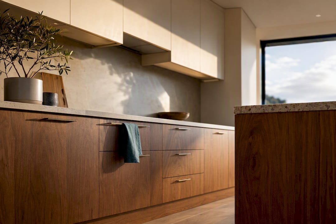
Two-tone kitchen cabinets suit most homeowners, provided the pairing respects undertone and proportion. The safest, longest-lasting approach for 2026 is warm white or cream uppers with medium walnut, oak, or a deeper painted colour on the lowers or island. Get the undertones matched and keep one colour dominant, and the result reads considered rather than gimmicky.
TL;DR:
Use sample doors and photograph them under your kitchen’s lighting to ensure undertone accuracy across different times of day.
Maintain a 70/30 color ratio, with darker lower cabinets anchoring the space and lighter uppers keeping it open, especially in smaller kitchens.
Match hardware finishes consistently across both colors and choose semi-gloss or high-gloss paint for durability and ease of cleaning.
Prioritize a full-service renovation to coordinate trades effectively, ensuring proper sequencing and color retention, particularly for complex two-tone schemes.
Be aware that warm white or cream with medium wood tones remains the safest, most resale-friendly pairing going into 2026, with tone-on-tone schemes gaining popularity.
Table of Contents
What are the best two tone kitchen cabinet layouts?
Five approaches account for most successful two-tone kitchens, and each suits a different room shape or renovation budget.
Island accent: paint or reface only the island in a bolder colour while perimeter cabinetry stays neutral. It’s the lowest-risk entry point into two colour cabinetry ideas, and an island repaint is genuinely reversible if you change your mind in a year. It works best when the island is large enough to read as a feature, not an afterthought.
Lower dark, upper light: darker lower cabinets ground the room while lighter uppers keep the space feeling open. This remains the default two-tone kitchen ideas pairing because it matches how light naturally falls in most kitchens.
Vertical or zonal splits: one wall, a pantry run, or a butler’s pantry gets a contrasting colour while the rest stays consistent. This suits open-plan kitchens with a defined “feature” zone, such as a coffee station or a floor-to-ceiling pantry wall.
Painted cabinetry paired with natural wood: painted uppers or island against timber lowers or open shelving adds warmth that an all-painted kitchen can lack, and softens the graphic look of two flat colours.
Tone-on-tone: two closely related shades of the same colour family, such as sage and olive, or two greys a shade apart. It’s subtler than a genuine two colour kitchen cabinet scheme but still breaks up a monochrome run.
Small kitchens generally do best with the island accent or a single feature wall, since a full lower/upper split can feel busy in a tight footprint. Kitchens with higher ceilings or long runs of cabinetry handle vertical splits and painted-and-wood combinations more comfortably, because there’s enough surface area for both tones to feel intentional rather than cramped.
Which colour pairings actually work?
Some kitchen cabinet colour combinations have proven durable across renovation cycles, and it’s worth borrowing from what’s already worked rather than inventing a scheme from scratch. Warm white or cream uppers with medium-stained walnut or oak lowers remains the most resale-safe two-tone combination going into 2026, largely because it pairs a light, adaptable colour with a wood tone most buyers already find familiar. Smoky jade lowers under cream uppers give a softer, more traditional character, while white uppers over deep indigo lowers read more contemporary and work well with brass or matte black hardware. All three pairings are common in current designer palettes precisely because the undertones sit comfortably together rather than fighting for attention.
Getting undertone matching right matters more than the colour choice itself.
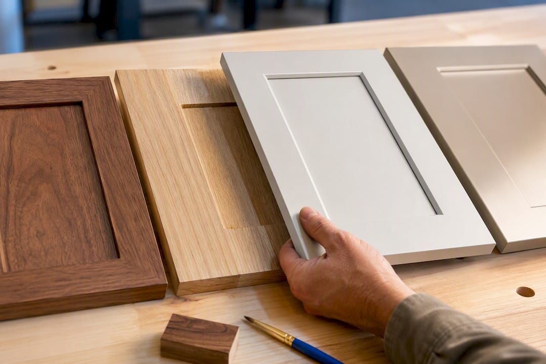
Buy sample doors, not just paint chips, and prop them against your actual benchtop and flooring.
Leave them in the kitchen for at least 48 hours to see how they read under morning, midday, and evening light.
Limit yourself to one or two wood tones total. Three different timber finishes in one kitchen almost always looks accidental rather than styled.
Pro Tip: Photograph your sample doors under your kitchen’s actual light at 8am, 1pm, and 7pm. A colour that looks warm and inviting at lunchtime can turn muddy or grey under evening downlights, and a photo catches that shift faster than the eye does in the moment.
How much of each colour should you use?
Getting the ratio wrong is the fastest way to make a two-tone kitchen look like two separate renovations. Follow these rules in order.
Keep one colour dominant. A roughly 70/30 split, two-thirds one tone to one-third the other, avoids the visual halfway line that makes a kitchen look unfinished.
Let the darker tone sit low, as a rule. Darker lowers anchor a kitchen visually and hide daily marks better than dark uppers do at eye level.
Only invert the rule with genuine light and height. Dark uppers over light lowers can work, but generally only in kitchens with high ceilings, skylights, or large windows that offset the visual weight above head height.
Size the island to the accent. An island under about two metres can look overwhelmed by a bold contrasting colour; anything smaller usually reads better sharing the perimeter’s dominant tone.
Recalculate for floor-to-ceiling runs. Tall pantry cabinets or a floor-to-ceiling wall unit count as a large surface area fast, so treat them as part of the dominant colour unless they’re the deliberate feature.
What finishes and hardware tie two tones together?
The paint sheen and hardware you choose matter as much as the colours themselves, because they’re what make two different cabinet colours look like one coherent kitchen rather than two competing ones.
Choose semi-gloss or high-gloss for cabinet paint. Glossier finishes wipe clean more easily than matte, which matters in a room that sees daily grease and splashback.
Pick one hardware finish, whether that’s matte black, brushed brass, or brushed nickel, and use it across both cabinet colours. Hardware consistency is one of the fastest ways to make a split scheme read as intentional rather than mismatched.
Lacquered paint suits contemporary, high-contrast schemes; stained timber suits warmer, wood-forward pairings. Mixing the two is fine, but match the warm or cool bias of the stain to the paint’s undertone before committing.
Countertops and splashbacks can act as a visual bridge between the two cabinet colours, so choose them with both tones in mind, not just the dominant one.
Pro Tip: If you’re mixing painted cabinetry with timber, hold a sample stain board flat against your flooring at eye level, not on the bench. Undertone clashes show up far more obviously against timber flooring than they do sitting on a benchtop.
What does a two-tone kitchen cost to get right?
Two-tone schemes tend to cost more in labour than a single-colour kitchen, and it’s the masking and spraying, not the paint itself, that drives the difference.
Painting existing doors is cheaper than replacing cabinetry outright, but a two-colour job needs separate masking and often separate spray runs for each colour, which adds hours to the quote.
Wider price ranges typically come down to whether doors are painted in situ, sprayed off-site in a workshop, or replaced entirely, so ask any quote to specify which method it’s costing.
If budget is tight, paint the island first and leave the perimeter as-is. It’s a staged way to test a bold colour without committing to the full kitchen at once.
Matching a stained timber lower to an existing benchtop or floor generally costs more than an all-painted scheme, since timber matching is harder to get right on the first attempt.
For New Zealand homeowners costing out a renovation, Sortedhomesolutions’ kitchen and bathroom pricing pages give a starting point for what a managed two-tone project typically involves.
When should you bring in a full-service renovator?
If you want the colour decisions handled alongside the trade work, a managed renovation removes most of the guesswork around sequencing, sample approval, and hardware sourcing.
Ask for a fixed price that specifies painting method, coats, and hardware allowance, not just a lump sum.
Ask how trades are coordinated. Cabinetry, painting, and benchtop installation need to land in the right order for a two-tone finish to look clean.
Ask for a realistic timeline and whether sample doors are supplied before the full job is committed to.
Ask what warranty covers the paint finish and hardware specifically, not just the build.
Treat vague pricing or no visible portfolio as a red flag. A renovator confident in their two-tone work should be happy to show completed kitchen projects.
Managing the full run of trades under one point of contact matters most in a two-tone job where colour decisions need to survive contact with plumbers, electricians, and cabinet makers without getting lost.
How do you clean and maintain two-tone cabinets?
Two-tone kitchens don’t need different cleaning products, but they do need slightly different attention because the two finishes wear at different rates. Lighter uppers show grease and fingerprints more visibly than darker lowers, especially around handles and near the cooktop, so they typically need wiping down more often even though the actual dirt load is the same.
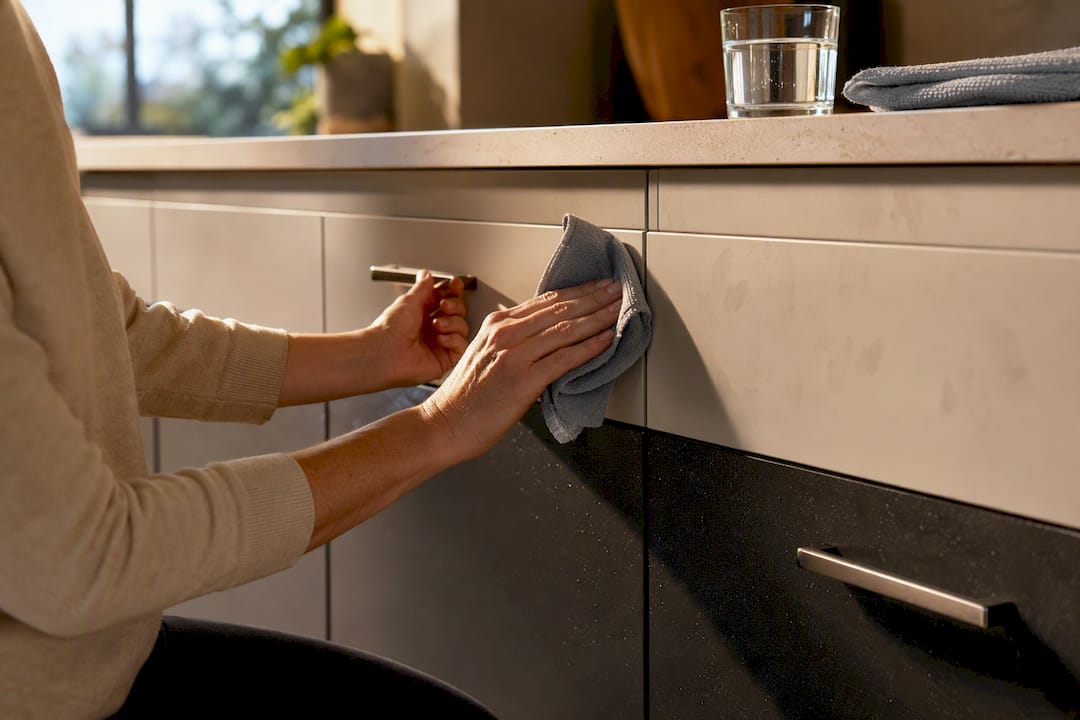
Darker lower cabinets show dust and water spots more readily than light ones, particularly in a matte finish, so a microfibre cloth run over them a couple of times a week keeps them looking fresh without needing a deep clean.
Stick to a mild dish soap and warm water for both tones rather than reaching for anything abrasive. Semi-gloss and high-gloss finishes tolerate a slightly firmer wipe than matte paint, which scuffs more easily and shows cloth marks under harsh light. If you’ve mixed painted cabinetry with stained timber, treat the timber sections with a wood-appropriate cleaner rather than the same product you use on the painted sections. Painted surfaces can handle a broader range of household cleaners; timber generally can’t, and using the wrong product on stained wood can dull the finish over months rather than showing damage immediately.
Check hinges and hardware on both colours at the same interval. A loose hinge on the darker lower cabinets is often less visible until the door itself starts to sag.
Which cabinet materials suit a two-tone design?
Material choice affects how well a two-tone scheme actually holds up, not just how it looks on day one. Solid timber and quality veneers take stain and paint more evenly than lower-grade MDF, which matters most on the painted side of the kitchen, since a smooth painted finish shows any surface imperfection far more than a wood grain does.
For the wood-toned half of the kitchen, go with timber veneers or solid timber over laminate that only mimics wood grain. Photographic laminates can look convincing in a showroom but tend to look flatter next to a genuinely painted surface, and the contrast between real timber and a painted finish is part of what makes wood-and-paint two-tone kitchens feel warm rather than flat.
For the painted half, a properly primed MDF door with a sprayed lacquer finish generally outperforms a hand-painted timber door for durability and smoothness, provided it’s sprayed rather than brushed. Brushed paint on cabinetry tends to show streaks under kitchen lighting in a way that a sprayed finish avoids entirely.
If you’re combining stains and paints, test material samples side by side under your actual lighting before committing, since materials read differently once installed than they do on a showroom sample board. Cabinet box material matters less visually, since it’s rarely seen, but plywood boxes generally hold hardware and hinges better over time than particleboard.
How does lighting change the way two-tone cabinets look?
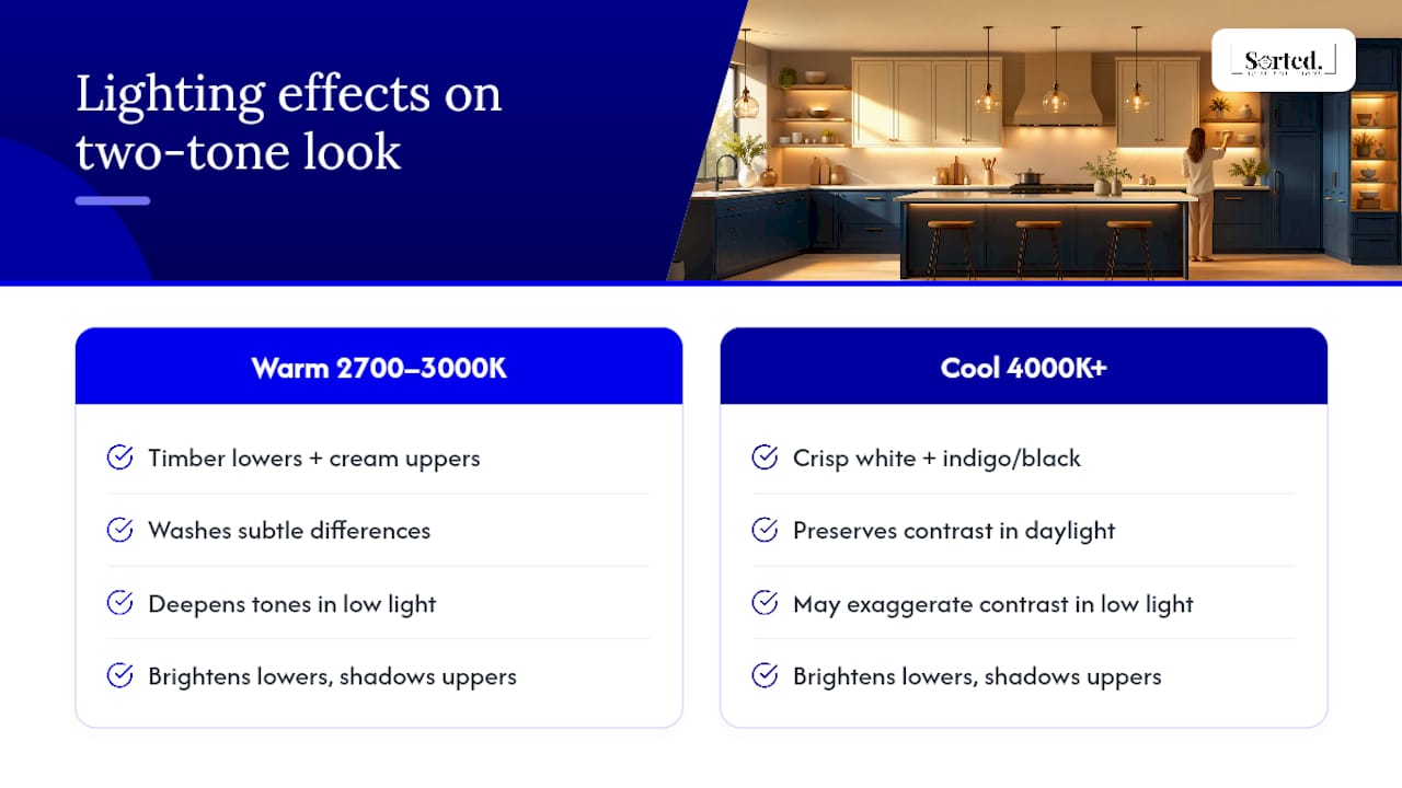
Lighting shifts a two-tone kitchen more than almost any other variable, which is exactly why sample testing under real light matters so much more here than in a single-colour kitchen. A pairing that looks balanced under a showroom’s cool white downlights can shift entirely under your own kitchen’s warmer bulbs, and the undertone clash that ruins a scheme almost always shows up at home, not in the shop.
North-facing kitchens with strong natural light tend to wash out subtle colour differences during the day, which can make a two-tone scheme look closer to one colour than intended until the sun moves. South-facing or low-light kitchens do the opposite, deepening both tones and sometimes exaggerating a contrast that felt subtle on the sample door.
Under-cabinet lighting adds another layer, since it illuminates the lower cabinets directly while leaving uppers in comparative shadow, which can make the proportion split look uneven even when the actual cabinet area follows the 70/30 rule. Warm LED strips (around 2700K to 3000K) generally favour timber lowers and cream uppers, while cooler LEDs (4000K and above) tend to suit the crisper white-and-indigo or white-and-black pairings.
Test your sample doors under every light source the kitchen actually has, including natural light at different times of day, before ordering full cabinetry.
What are the current trends in two-tone kitchen design?
The dominant shift going into 2026 is away from stark, high-contrast pairings and toward warmer, more considered combinations. Design commentary increasingly frames two-tone cabinetry as a mature design method rather than a passing trend, but the same sources caution that formulaic, high-contrast execution, black against stark white with no warmth anywhere, is the version most likely to date quickly.
Warm white or cream uppers with medium walnut lowers remain the most consistently recommended pairing, alongside softer combinations like smoky jade and cream. Deep indigo paired with white uppers holds steady as the more contemporary option for kitchens that want colour without going fully bold. Tone-on-tone schemes, two closely related shades rather than a stark contrast, are gaining ground among renovators who want the visual interest of two colours without the risk of a scheme feeling loud in five years.
The island-as-accent approach continues to dominate as the entry point for homeowners nervous about commitment, largely because it’s the easiest element to repaint later if tastes shift. Mixed material schemes, painted cabinetry against real timber rather than two paint colours, are also gaining traction as homeowners chase warmth over pure contrast.
Rudi’s take on getting this right the first time
The kitchens that age badly aren’t the ones with bold colour. They’re the ones where nobody checked the undertones against the actual flooring before ordering doors. I’ve seen a “warm white” turn distinctly pink next to grey oak boards, purely because nobody propped a sample against the floor first.
Stick to one dominant tone, one hardware finish, and test everything under your own lights before you commit. That formula outlasts whatever’s trending.
— Rudi
Ready to plan your two-tone kitchen?
Getting a two-tone kitchen right means coordinating paint sprayers, cabinet makers, and hardware suppliers so the undertones and proportions land exactly as planned, and that’s the coordination job that usually trips up a DIY renovation. Running every trade on a kitchen project under one point of contact, from cabinetry and painting through to benchtops and hardware, helps ensure the colour decisions you make at the sample stage actually survive through to installation.
If you’re weighing up painting existing doors against a full cabinetry replacement, our kitchen renovation pricing page breaks down what typically drives the cost either way. For a fully managed renovation covering kitchens end to end, our full home renovation service handles the sequencing so your two-tone finish comes together in the right order. Ready to talk through your layout and colour options? Get in touch for a quote and we’ll help you plan it properly from the first sample door.
Sources
Recommended
Comments